-
Notifications
You must be signed in to change notification settings - Fork 15
List Item Base Widgets
Shane Looker edited this page May 15, 2020
·
2 revisions
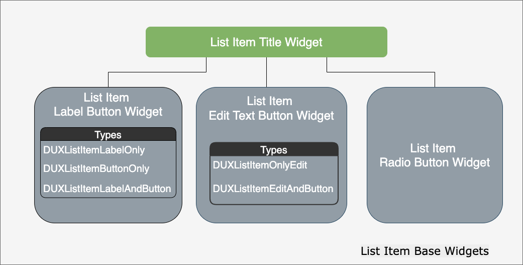
Most of the list item widgets follow similar UI traits. To provide ease of implementation and uniform behavior, a set of abstract classes is used to build the list item widgets. These are classified as list item base widgets.

This widget defines the UI elements that each list item should have.

The UI elements can be customized to match the style of the user's application. The customizations can be done programmatically using the APIs.
List of the customization APIs
-
UIFont *titleFont;- The font/size to use for the title. -
UIColor *titleColor;- The color to draw the title with. -
UIColor *iconTintColor;- The tint color applied to the icon. -
UIColor *backgroundColor;- The background color for the widget. -
UIImage *iconImage;- The icon to be drawn on the left side of the widget.
The widget provides hooks for users to add functionality based on state changes in the widget.
The list item base widget provides the following hooks:
-
ListItemTitleModelState- Provides hooks in events received by the widget from the widget model updates.
-
+ (instancetype)productConnected:(BOOL)isConnected- Event sent when product is connected or disconnected.
-
ListItemTitleUIState- Provides hooks in events received by the widget from the user interface interactions.
-
+ (instancetype)dialogDisplayed:(id)info;- Sends the string identifier for a dialog being displayed (usually in response to a button tap or edit value update). -
+ (instancetype)dialogActionConfirm:(id)info;- Sends the string identifier for a dialog after the OK/Confirmation button was tapped in the displayed dialog. -
+ (instancetype)dialogActionDismiss:(id)info;- Sends the string identifier for a dialog after the Cancel/Dismiss button was tapped in the displayed dialog.
This widget has been further expanded into:
DJI UX SDK Version 5 Beta 4.1