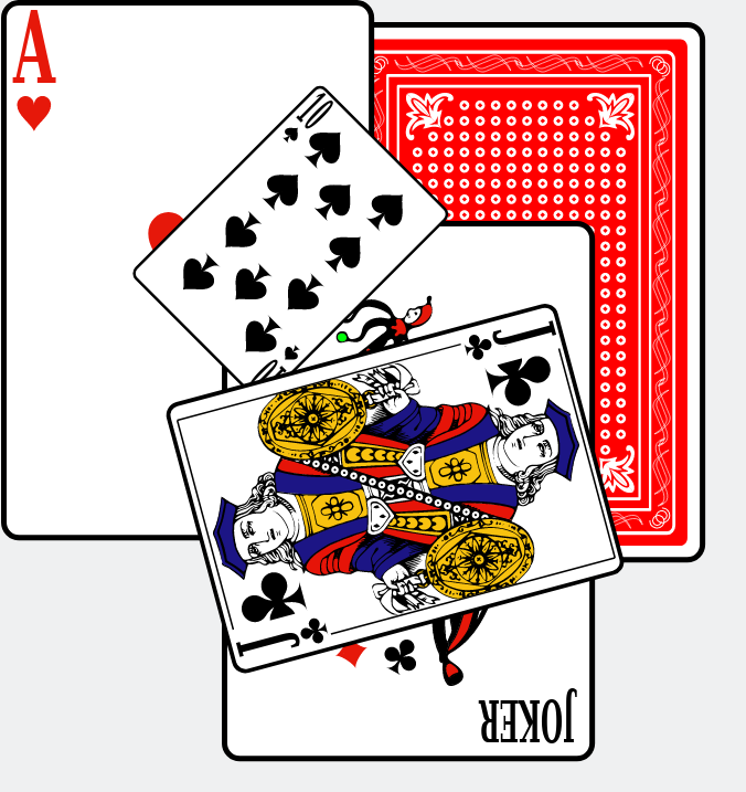
A set of playing cards in SVG, now also with a rendering in PNG and installable via NPM.
- Version: 4.0.0
- License: LGPL-2.1
SVG-cards is a fork of SVG-cards 2.0.1, which was created by David Bellot. He writes in the README of the original package:
This is a set of playing cards made in pure SVG with all kings, queens, jacks, numbers, jokers and backs of cards. This set of SVG files is intended to be used in games, figures, illustrations, web sites as long as you provide the code source and the LGPL license (see the COPYING file). Although this is a free software, the license is the LGPL so you can use this set of cards even in a non-free software.
The kings, queens and jacks are based on the French representation, because I find them beautiful. You can access to each either by rendering the file into a pixmap and clipping each card or by using their name with a DOM interface.
I agree with David that these cards are beautiful! I am grateful for his work and that he published them under an open source license. However, while playing around with the SVG file containing the cards, I found that using the cards in SVG was not as straightforward as I would have liked. For example, I expected the following line,
<use href="svg-cards.svg#joker_red" x="40" y="12"/>To put the red joker card with its top-left corner at (40, 12). It does not, as it takes into account the place of the red joker in the SVG file: the card top-left corner shows up at (207.575, 750.55).
In this fork I translated all cards to set their top-left corner at the origin (0,0). After this change, the above USE element works as expected: it places the red joker card's top-left corner at (40, 12).
SVG-cards is just an SVG file. You use it like you would any other SVG file. See MDN's documentation about SVG to learn about SVG.
-
Go to the directory you want to install and use the SVG cards:
cd /path/to/dir -
Install or download SVG cards. Use one of the following three alternatives:
-
Install via NPM:
npm install --save svg-cards
In the example below (step 3), replace all occurrences of
href="svg-cards.svg"byhref="node_modules/svg-cards/svg-cards.svg". -
Clone this repository:
clone git@github.com:htdebeer/SVG-cards.git
In the example below (step 3), replace all occurrences of
href="svg-cards.svg"byhref="svg-cards/svg-cards.svg". -
Download the SVG file.
-
-
Create a file
test.htmlin that directory with the following contents:<!DOCTYPE html> <html lang="en"> <head> <meta charset="utf-8"> <title>Example SVG with cards</title> </head> <body> <h1>Example SVG with cards</h1> <svg width="600" height="400" xmlns="http://www.w3.org/2000/svg" xmlns:xlink="http://www.w3.org/1999/xlink" > <!-- The cards have a natural width of 169.075 and a height of 244.640. Its center is located at (+98.0375, +122.320). --> <!-- The original back color was #0062ff. The color of the back card can be changed by setting the fill on the USE-element. --> <use href="svg-cards.svg#back" x="150" y="10" fill="red"/> <use href="svg-cards.svg#heart_1" x="0" y="0"/> <use href="svg-cards.svg#joker_black" x="100" y="100"/> <use href="svg-cards.svg#spade_10" x="200" y="200" transform="rotate(45,198.0375,122.320)scale(0.5)" /> <use href="svg-cards.svg#club_jack" x="300" y="100" transform="rotate(75,198.0375,122.320)scale(0.75)" /> </svg> </body> </html>
We use inline SVG in our HTML document. Inside that inline SVG we refer and link to the
svg-cards.svgfile via theUSEelement.-
For transforming the cards after including them in your SVG with the
USEelement, it is good to know that the cards have the following natural dimensions:- width: 169.075
- height: 244.64
- center: (+98.0375, +122.320)
-
You can change the color of the back card by setting the fill on the USE-element. For example:
<use href="svg-cards.svg#back" x="150" y="10" fill="red"/>
-
The various cards have the following names:
- Jokers: joker_black and joker_red
- Back card: back or alternative-back
- Picture cards: {club,diamond,heart,spade}_{king,queen,jack}
- Pip cards:{club,diamond,heart,spade}_{1,2,3,4,5,6,7,8,9,10}
Examples:
- The ace of club is
club_1. - The queen of diamonds is
diamond_queen.
And so on…
-
The following extra shapes are also available:
- card-base, with the same dimensions as a card
- suit-club
- suit-heart
- suit-diamond
- suit-spade
These suit shapes have the following dimensions:
- width: 15.42
- height: 15.88
- center: (7.71, 7.94)
-
The default back card might be too complex to be rendered swiftly in a web browser. For example, when I rendered a deck of 52 cards facing down, it took my browser almost 2 seconds to render about 50,000 elements in the DOM. To overcome these issues, use a simplified alternative back card with name
alternate-back.
-
-
Run a web server in that same directory, for example using the JavaScript program http-server:
http-server .This will start a web server that serves the current directory on port 8080.
-
Open a web browser like Firefox and navigate to http://localhost:8080/test.html.
You should see the example with the five cards shown at the top of this README.
I have also added a nicely formatted SVG file, svg-cards-indented.svg, which
makes the SVG file easier to inspect using a text editor. Converting from
indented to unindented version goes via
xmllint:
xmllint --noblanks svg-cards-indented.svg > svg-cards.svgTo automatically convert these SVG files to PNG I developed a separate
project: svg-cards-to-png. For
convenience, this repository contains PNG files in the png
subdirectory. In the two directories png/1x and png/2x you find PNG files
of the SVG cards with, respectively, their natural dimensions and twice their
natural dimensions. Furthermore, these PNG files come with 16 different colored back cards.
desphilboy has made this project into an NPM package to make it easier for web developers to use it in their projects. Now it can be installed and used like other dependencies:
npm install --save svg-cardsIn July 2018, Thomas Linard improved the SVG files by making them compliant with the SVG specification.
