This light-weight library provides images with letter/text like the Gmail or Android contact apps
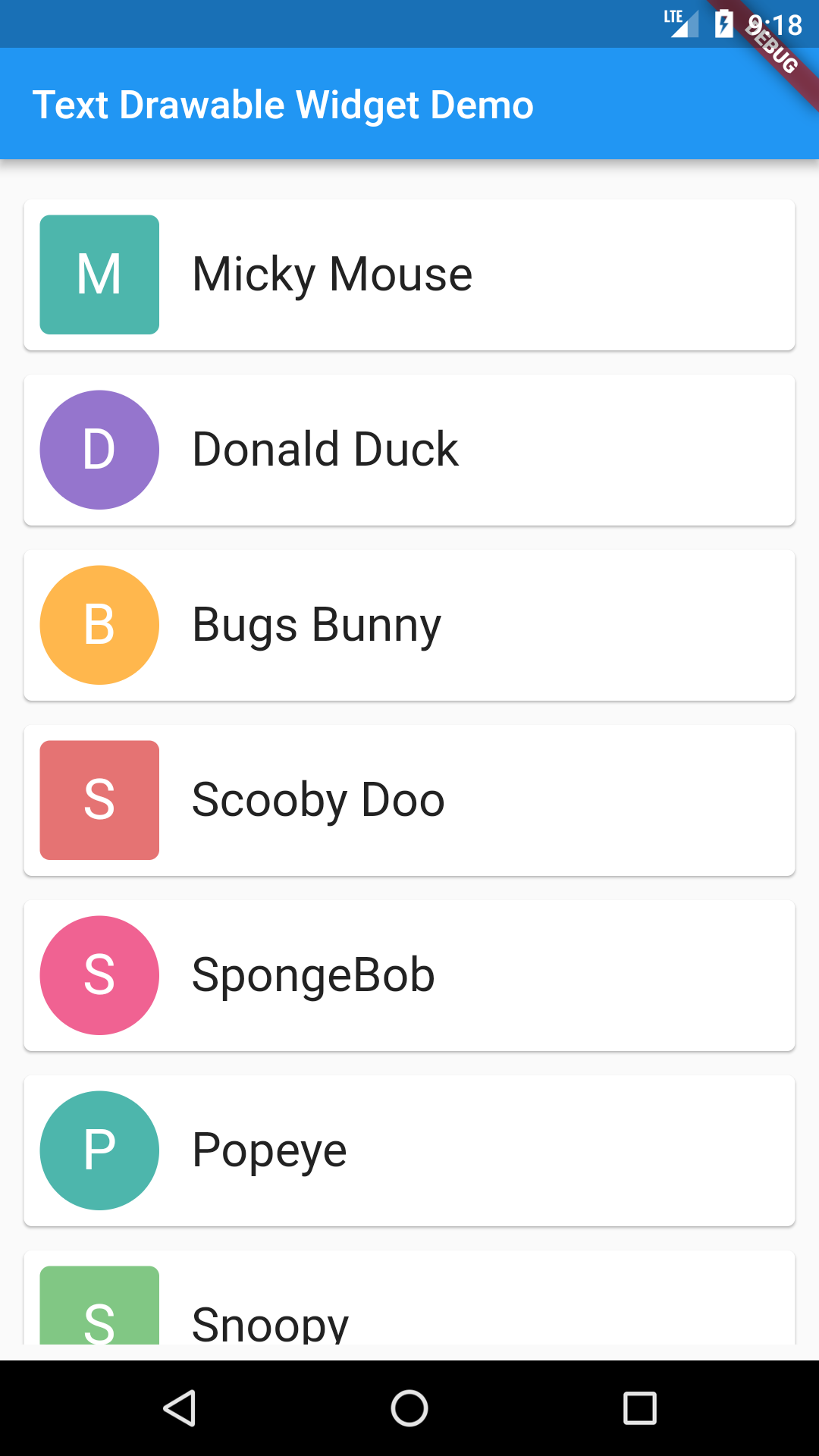
Text Drawable Widget support 2 types of mode, 1 is the default mode and other is more customizable advance mode.
To use default mode, import the text drawable widget file in your project and add following line
TextDrawableWidget(data, ColorGenerator.materialColors, (bool selected) {
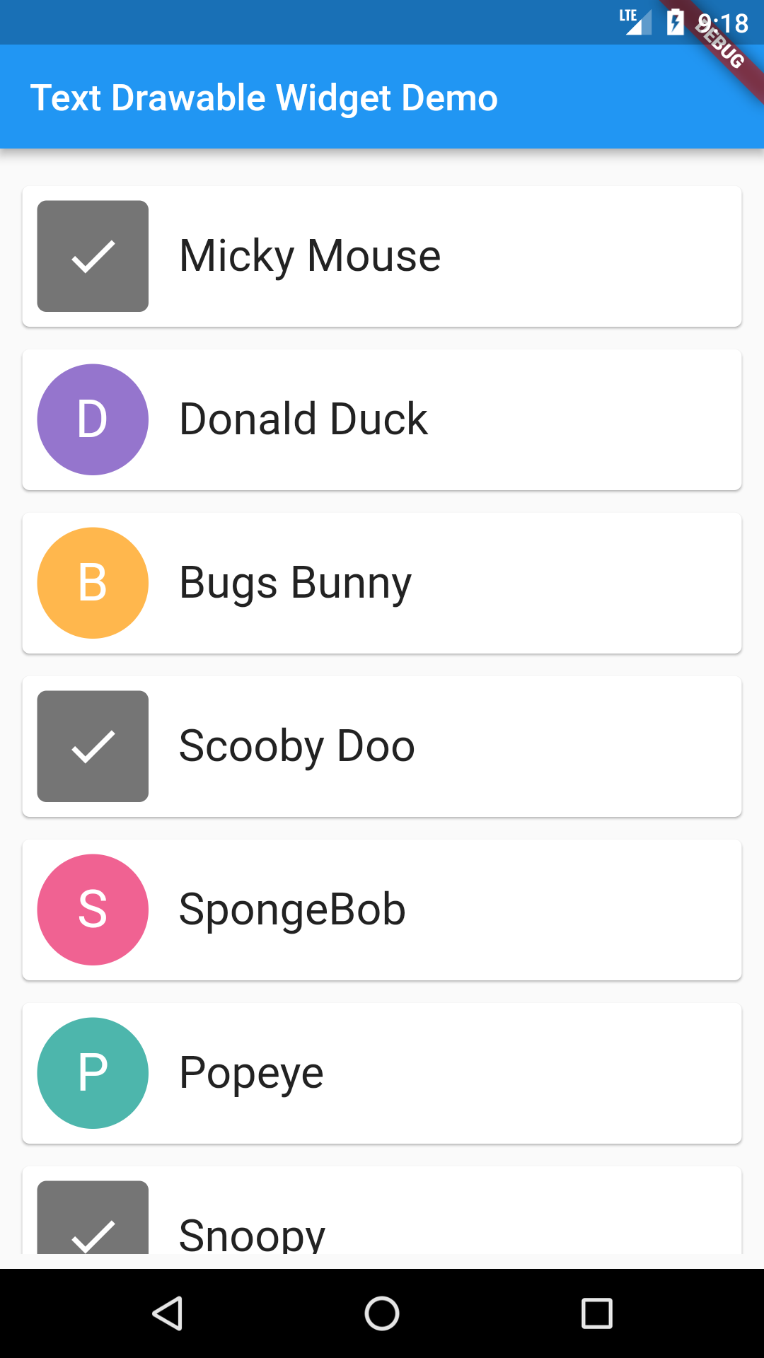
// on tap callback
}),
This will add the text drawable widget, with default size, colors and fonts. Default size is 60 * 60 with a text style of size 28 and color white.
You can customize everything in text drawable widget. From fonts to size of the widget. Here are options that you can customized.
- Width and height of widget.
- If widget is tapable or not. With this option you can disable the tap behavior.
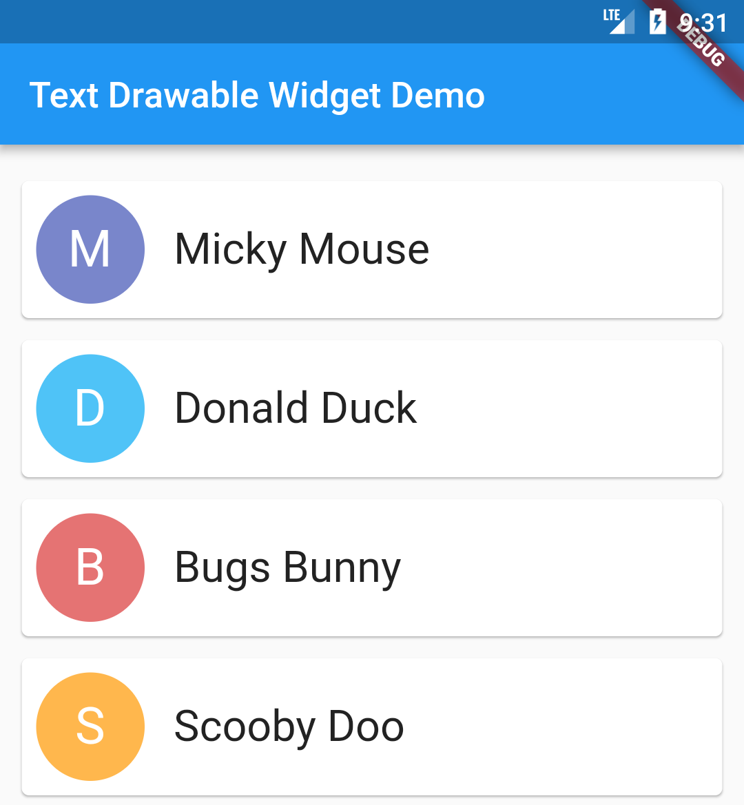
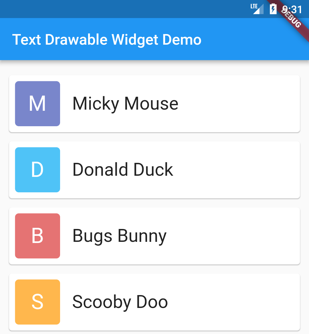
- Shape of widget, currently we support Circle and rounded corner Square.
- Text Style, you can customized the text style with any color, fonts, size of your choice.
Example with full customization :
TextDrawableWidget(data, ColorGenerator.materialColors, (bool selected) {
                  // on tap callback
                  print("on tap callback");
                }, true, 60.0, 60.0, BoxShape.rectangle,TextStyle(color: Colors.black, fontSize: 28.0))
By default this library ships with 2 sets of colors, material color and default color. But you can customize the color list and give any colors of your choice.
To give a different color, use the following code
ColorGenerator.create(colorList). It takes List
You can mix and match the default and customizable mode, check the example project.