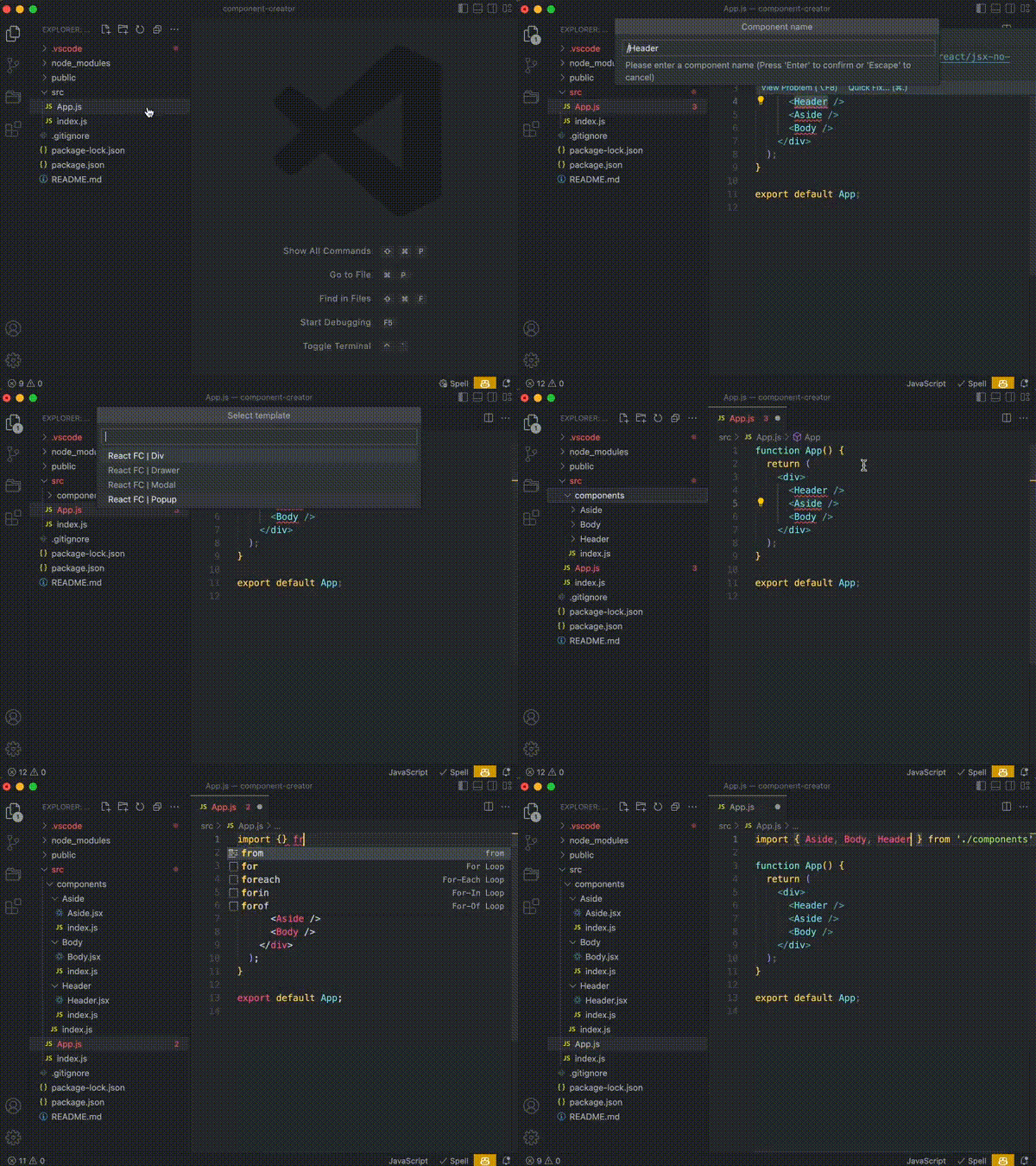
Component Creator is an open-source extension for Visual Studio Code, designed to easily creating components based on yours templates.
- Support for creating empty folders in templates.
- Creating a component in the selected directory 💥
- Creating your own templates 💥
- Any language support 💥
- Each project has its own setup 💥
- Call an extension number, there are three ways to do this:
- Right-click on the directory in Project Explorer, then select the menu item “New component...”;
- Select the text inside the file, right-click on the selected text and select the menu item “New component ...”. The selected text is automatically entered in the name of the component;
- Run the command palette (
Cmd/Ctrl+Shift+P), then type “>New component ...”. This method is the most undesirable, since it is important for it that at least some file is opened, otherwise the extension will not determine in which directory to create the component.
- Enter the name of the component. If you enter a relative path in the component name, the extension will create the necessary directories. For example, if you specify
../components/multi selectin the component name, the extension will create a ”component” folder in the parent directory, and then create a “multi select” component there. - Select a template from the list. If you have only one template, the selection field will not be shown. If you don't have templates, the extension will offer to download one from the library. The template “! Example of all transform styles” will demonstrate all possible transforms of the component name.
-
A folder with the template name is created in the template directory. The default path is
./.vscode/cch-template, can be changed in the settings. -
Any structure of folders and files is created inside this directory. In order to insert a dynamic component name, you can use the template {{caseName}} (all transformations are listed below). For example, if you entered name
{{kebabCase}}.props.tsin the file name, and then when creating the component, specifyMulti selectas the name, then the filemulti-select.props.tswill be created as a result. It also works for the body of the file. -
If you add
{{concat}}to the beginning of the file name, then the contents of this file will be added to the existing file, and if this file is not exist, the file will be created.Let's say we create the file
{{concat}}index.tswith this content:export * from'./{{pascalCase}};
Then, we create a template named
body, but in the directory where the file “index.ts” should be loaded, there is already such a file with the contents:export * from'./Header'; export * from'./Aside';
The {{concat}} flag will make it clear that the template content will need to be added to this file. In the example , you will get this content:
export * from'./Header'; export * from'./Aside'; export * from'./Body';
The directory where the templates are stored. If you specify the path using ./ the workspace directory will be selected If you specify the path using ~/ the operating system user directory will be selected.
{
  "componentCreatorHelper.templateDirectory": "./.vscode/cch-template",
}Extension language
Available: en, ru
{
  "componentCreatorHelper.language": "en"
}| Transform | Example | Result (component name: Color picker InPut) |
|---|---|---|
| Camel case | {{camelCase}} | colorPickerInPut |
| Pascal case | {{pascalCase}} | ColorPickerInPut |
| Snake case | {{snakeCase}} | color_picker_input |
| Upper snake case | {{upperSnakeCase}} | COLOR_PICKER_INPUT |
| Kebab case | {{kebabCase}} | color-picker-input |
| Upper kebab case | {{upperKebabCase}} | COLOR-PICKER-INPUT |
| Dot case | {{dotCase}} | color.picker.input |
| Upper dot case | {{upperDotCase}} | COLOR.PICKER.INPUT |
| Transform | Example | Result (component name: Color picker InPut) |
|---|---|---|
| Without transform | {{none}} | Color picker InPut |
| Without transform and spaces | {{normal}} | ColorpickerInPut |
| Camel case | {{camelCase}} | colorPickerInPut |
| Pascal case | {{pascalCase}} | ColorPickerInPut |
| Upper case | {{upperCase}} | COLORPICKERINPUT |
| Lower case | {{lowerCase}} | colorpickerinput |
| With snake delimiter | {{normalSnakeCase}} | Color_picker_InPut |
| Snake case | {{snakeCase}} | color_picker_input |
| Camel snake case | {{camelSnakeCase}} | color_Picker_InPut |
| Pascal snake case | {{pascalSnakeCase}} | Color_Picker_InPut |
| Upper snake case | {{upperSnakeCase}} | COLOR_PICKER_INPUT |
| Lower snake case | {{lowerSnakeCase}} | color_picker_input |
| With kebab delimiter | {{normalKebabCase}} | Color-picker-InPut |
| Kebab case | {{kebabCase}} | color-picker-input |
| Camel kebab case | {{camelKebabCase}} | color-Picker-InPut |
| Pascal kebab case | {{pascalKebabCase}} | Color-Picker-InPut |
| Upper kebab case | {{upperKebabCase}} | COLOR-PICKER-INPUT |
| Lower kebab case | {{lowerKebabCase}} | color-picker-input |
| With dot delimiter | {{normalDotCase}} | Color.picker.InPut |
| Dot case | {{dotCase}} | color.picker.input |
| Camel dot case | {{camelDotCase}} | color.Picker.InPut |
| Pascal dot case | {{pascalDotCase}} | Color.Picker.InPut |
| Upper dot case | {{upperDotCase}} | COLOR.PICKER.INPUT |
| Lower dot case | {{lowerDotCase}} | color.picker.input |
Dmitriy Basenko GitHub, Twitter, Telegram
